So I was feeling like my blog needed a bit of refreshing now that I'm blogging again, after my break...and was even (duck) considering changing over to another blogland site...but come to find out, Blogger has upped their game - in a BIG way. I was pleasantly surprised to find out how easy it was, this time, to change the look of my blog - without having to go searching on the web for a new blog design, and then try to tweak it to fit into one of Blogger's limited blog templates. The choices for layouts were plentiful, and then the detail-tweaking was very user-friendly for non-tech geeks like me...down to width of columns, colors and font choices, etc. The only things I imported from outside Blogger were the header (www.shabbyblogs.com) and the little titles over the sidebar columns (same site).
So, what do you think? Like? Love? Hate? I tried to make it a little more reader-friendly and less-busy. The one thing I haven't had a chance to do yet is take a look at it in all my browsers - I'm working in Google Chrome right now - so those of you in other browsers, let me know if you have any issues with it!!
OH - and another cool thing Blogger made super easy - adding tabbed pages - you can add up to TEN pages to your blog!!! I was THRILLED with this added ability, as I've always wanted that ability and had to search high and wide in the past to find a template that created that ability for me. So check out the two extra pages I've created so far - my Artwork page and my Ciao Sorella page (the tabs are just under the header).
Overall, I give Blogger a BIG thumbs up on this one! If you are looking to update your Blogger site, go to your Dashboard, then to "Design" and check out the new "Template Designer" for all the new details I've referred to.

Friday, August 27, 2010
Wednesday, August 25, 2010
Inspiration Wednesday 8/25/10

Once again, it's almost "Inspiration Thursday..." but I'm working on it, really, I am!! :) Today's page was a bit of a challenge for me. I actually STARTED it last Saturday, when I was stuck on bedrest, and was playing with my watercolor crayons and watercolor pen/brush thing-a-ma-jig - in bed. I had painted one half of the page orange and the other half pink, and planned to build on it for this weeks IW page.
Then on Monday of this week, once I got off bedrest (another story for another day), I decided I wanted to try doing some modeling compound on the page, so did a little more work. I used Donna Downey's HUGE foam tree stamp and first stamped the trunk and branches using some Folk Art brown of some shade; dried that, then stamped the leaves using Golden fluid acrylics Phtalo Green. After that was all dried, I used Golden Molding Paste with the leftovers from some butterflies I had recently cut on a Cricut machine (I kept them for this purpose) and created 3 butterflies on the page - a large, medium, and small one. I knew they would need time to dry, so I left them to dry for a couple days (it doesn't actually take that long).
Finally, today, Wednesday, the day I look forward to every week...Inspiration Wednesday. I couldn't wait for my kids to go down for a nap. I watched Donna's video in awe...I always love her work. It's always inspiring. It also made me long for fall, for some reason, and I suddenly hated the extra-bright colors on my page even more than I already had been when I woke up this morning. So I took some Golden fluid acrylic Nickel Azo Gold to darken the orange some, and a mixture of Golden fluid acrylic Quinacridone Magenta and heavy body acrylic Ultramarine Violet, and carefully spread those over the page, making sure not to accidentally paint my butterflies before I was ready to. I painted right over those green leaves that were just way to springy and summery for my fall-wishing self. And still, it was all too bright. So out came the Golden Titanium White airbrush paint - time for some drippage!! Finally - things got toned down!! I still wasn't sure I was going to love the outcome, but at least we were getting somewhere. I think the next thing I did was actually to run the top of the page through my new toy, the Zutter Distrezz-it-All. And then I added a couple lines of stitching with my sewing machine along the right side of the page, just because it felt right.
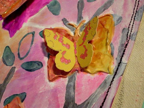
Then, finally, I was ready to paint the butterflies. I debated over whether to use paint - and if so, what kind? But in the end, I decided to try something new - why not? I wasn't loving anything else really so far, so why not try something else new? So I got out my blending pens which almost never get used, and my new Ranger alcohol inks to see if they could be used together. I didn't actually Google it. I just went for it. And it seemed to work. I actually really like how they turned out, and how I was able to mix colors. I used Wild Plum and Butterscotch, in case anyone is wondering. Cool thing I learned? When the ink dried out in my little palette, I added a little denatured alcohol to it, and I was able to pick it right back up with the blending pen!! After each of the butterflies was painted, I added a Cricut-cut paper butterfly on top - using Beacon 3-in-1 craft glue - love that stuff!! On this top butterfly, I covered the paper one with Tim Holtz's Rock Candy crackle paint - LOVE - and when that was dry, down the center, I added some orange flocking and a line of clear Stickles. (Don't mind my inky finger - they seem to look like that a LOT these days!) The second butterfly (the middle sized one) is above, and I just added a store-bought paper butterfly to it.

This one below is the smallest of the three molding paste butterflies, and again, I added a store-bought ephemera butterfly to it. Loving the pink and orange. You can see the incredible build-up and texture of the molding paste.

This next pictures shows the stitching, as well as the edge of a tag I added to the lower right part of the page. The tag also came from my ephemera box. I ran the edge of the tag through the Distrezz-it-All (LOVE that thing!), and stitched another paper butterfly onto the tag (also covered in Rock Candy crackle paint). I also used distressing ink around the edges of the butterfly and the tag.

After how much I struggled with coming to LOVE this page, (which I finally did come to LOVE), and truly experimenting with new things...I couldn't think of a better quote stamp to put on this page!! This is another Donna Downey stamp, and is in the "She Said" stamp set. (A fabulous set if you are going to buy just ONE of her sets, though they are ALL fantastic!!) I wanted this quote to really pop, so I used my VersaMark embossing ink pad and black embossing powder - but I also tried something totally new. First I added a strip of some totally random black pipe tape or something to the page (really, I have no idea what kind of tape it is!). Then, I wanted to make sure the word "BELIEVE" was on a piece of masking tape - it took a little extra work, but wasn't too hard (if you want details, let me know, and I'll explain how to do it).

A look at the entire tag. I have a lot going on in my life right now, and a lot of it is new...so the "change is good" quote is fitting. I have, because of my fumble fingers, pretty much quit trying to tie ribbons through holes, so I am totally loving the Tim Holtz Tiny Attacher (no, I am not getting paid by either Donna or Tim, though you would think I am by how much I mention their products, eh?!). Seriously - this little tool is THE. BEST. TINY. STAPLER. EVER. When someone else said that, I thought, "Come on, how good could it be?" That good. Really. Get one. You will not regret it!! So now I use my Tiny Attacher to staple my ribbons to my tags - SO much easier than fighting to tie ribbons through holes!! I attached the tag to my page by sewing it right to the page!! (I was in a sewing mood today, I guess.)

The next two pictures give you a better look at the "white" mini-pom-pom fringe I glued to the bottom of the page. I love how it turned out. It really did start out white. That was before I dunked it in a little bowl with some water and a few drops of Wild Plum alcohol ink, followed by some time in front of my blow-dryer (did I mention my heat gun died mid-way through this page?). Then I spritzed it a couple times with Tiger Lily Glimmer Mist and blow-dryed it again (trust me - SO not as effective as a heat gun - I think it was still slightly damp when I glued it onto the page).


I learned my lesson today. Never make up your mind until your art is COMPLETELY finished!! I was convinced I was NOT going to like this page! And now I think it's one of my favorite so far!! :)
Sunday, August 22, 2010
Happy Birthday Daddy!!
This past Thursday was my husband's birthday. I'm always at a loss as to what to have the kiddos do for him for his birthday (or, for that matter, what to do for him myself...). I had made plans to have someone watch the kids so he and I could have a date night at the movies (a first in a LOOOONG time), which I knew he would enjoy. And as I sat thinking of birthday card ideas for the kids to make, while we ate our Pizza Hut pizza hut, an idea formed in my head.

We finished dinner, and I told the kids we had to work quickly (this was Wednesday night) before Daddy got home from work. I cut the lid off one of the pizza boxes. Anthony was just dying to know what on earth I was going to do with THAT. I cut 4 squares from the pizza cardboard, about 4.25 inches by 4.5 inches each. I cut matching sized pieces of cardstock and glued them to either side of the 4 pieces of cardboard. I then cut 3 pieces of light yellow colored cardstock the same size and found a coordinating color (a rusty color) of acrylic craft paint. I took turns painting one of each of my kiddos' hands and had them make a hand print on a piece of the yellow cardstock. (This took some cajoling on my part for my sensory-challenged 2-year olds!) After quickly washing their hands before they could touch anything, I used my heat gun to dry the hand prints, then wrote their names and the date on each of their hand prints, and let them each draw on the opposite side of their hand prints.
Meanwhile, I began running the covered cardboard pieces through my fun new tool - the Zutter Distrezz-it-All - to distress the edges. Once the children were finished with their pieces, I also ran those through the Distrezz-it-All as well. I put the pages in order and glued down pictures of the children opposite their hand prints, adding additional photos on the other pages. I added a stamped greeting, a dated tag, some crumpled and inked book text, a piece of corrugated cardboard, and a playing card embellishment with a quote on it to the front of the booklet. I then used my Crop-a-dile to punch holes in all of the pages, near the top and bottom, and used book rings to make the entire thing into a little booklet.
You can see here how thick it is and the texture the pages have due to the cardboard and distressing:

Here are the pages inside the book:


Another example of what the Distrezz-it-All does:

More pages:


My husband loved the book/card, and now he has both something he can take to work with him to show off current pictures of his children, as well as a keepsake/mini-album that I'm sure he will treasure much longer than an ordinary birthday card!! And my son loves that we made it from a pizza box!! :)
Monday, August 16, 2010
Gotta love the everyday!!

As some of you know, I had the unbelievable privilege this past weekend of going away to a scrapbooking retreat house in the mountains with 4 other ladies - a Mother's Day gift from my AWESOME hubby!!! I actually hadn't done any scrapbooking in a VERY long time, up until my recent weekend of fabric scrapbooking workshops with Donna Downey - so I had been wondering what I was going to work on - but after those workshops, I knew precisely what I'd be working on! Since today's Mixed Media Monday's challenge is "Embellish It," I'm also linking up to them for my album, because there is TONS of embellishing going on throughout this album!!!
This blog post is VERY picture-heavy, so I'll do my best to keep my comments to a minimum. Just know that all but one front and back are canvas - I only did one paper front and back (can you spot it??). There are LOTS of embellishments throughout - including acrylic and watercolor paints, fabric, ribbon, buttons, patterned paper, book text, stamped images, heat embossed images,wire, flowers, beads, staples, eyelets, glossy accents, embroidered canvas tags and tabs, modeling paste, and even some corrugated cardboard recycled from the coffee cup cuff (what ARE those called?) that was around my coffee cup at breakfast on the way up to the retreat!


I do have to comment on this first page - we were told to paint "landscape" colors - and almost everyone in the class painted a blue sky and green grass. I wanted a purple sky and have no idea why I painted an orange ground - I just thought the colors were pretty together. Anyway, when I went to put the layout together, I was just thrilled with how the tag colors and the flowers and beads all coordinated so well with my colors. And I love the wire smoke. Tee hee.


I used Glossy Accents on my cut-strip ladder to make it look glossy to go with the shiny red playground ladder in the picture.


This page is one of my favorites, and was also one of the hardest to photograph. The acrylic paint on the modeling compound has quite a shine to it, so the flash on the camera glares terribly, but getting a good picture without the flash, inside, was rather difficult. But I love the colors, I love the swirl of the modeling compound...and I also LOVE the other technique I used on this page - gel medium to transfer a photocopied picture. I didn't know if it would work on gesso'd canvas (I had only tried it on paper before), but I was pretty happy with how it came out. For those who don't know, Mackenzie was born with a cleft lip and palate (and we almost lost her during delivery, and she was only 2 lbs, 15 oz at birth) - so her smiles are extra special...her smiles ARE proof of everyday miracles.


These next couple photos I took just to try to give you an idea of the texture and layers on this page - there are LOTS of them! I love the amount of embellishing and texture going on here!


This is another of my favorite pages. Turquoise is one of my favorite colors, and I just love everything about this page...the stamps, the flowers, the book text, the quote, the "journey" tag, the black and white photo. Love.


But this one. This one, I think, is my absolute favorite. When we did the base of this page in the workshop, it was a technique teaching us how to embed book text using gel medium, and then painting over it. Then we used the "trust your heart" stamp, and watercolored that - Donna Downey actually watercolored MINE, using it as an example - my friend Deanna got a great photo of her doing so. Anyway, I still wasn't sure what picture I was going to put on this page, and this weekend I was rifling through my giant stack of photos from the last 5 years or so...when I came across this one. It's a picture that is precious to me, both because breastfeeding is an issue near and dear to my heart (and one I'm passionate about), and because I really don't have many (if any other) pictures of me nursing any of my children. I don't even know who snapped this shot of me nursing my 6-week old firstborn - probably my husband, back in the ages when he used to take pictures of me! LOL Now it's all about the kiddos! Anyway, I just thought there couldn't be a more perfect picture to go with the "trust your heart" stamp than a nursing mama - because you absolutely have to trust your heart when you are a new, breastfeeding mama, and half the moms in the Western world are telling you how much "easier" it would be to just give the baby a bottle of formula!! And then the perfect quote - "Love comes from a place so deep it defies language." So true, especially the love between a mama and her 6-week old baby!!


And finally, the last page. Such a happy one...the colors, the look on my son's face...even the unexpected burst of red in the third button. I used a Tim Holtz Alterations Edges die (Sizzix) to die cut the coffee cuff and layer it under the canvas tag and photo. I love the look!!


And finally, I love the overall theme of the album - to embrace the everyday moments of our lives!!

Subscribe to:
Comments (Atom)