Monday, October 18, 2010

Thankful Card with Ink Bleeding Technique


I am participating in a free inking techniques class on 2 Peas given by Jennifer McGuire, called Holiday Thinking Inking.  (I actually missed the first week, though I did watch the videos, and jumped right in during the second week - so you can jump in NOW too!)  The instruction videos are posted both on Jennifer's blog and on 2 Peas, but you need to upload your challenge entries to your gallery on 2 Peas.  
Anyway, I made this card as part of the second week's challenges, using a technique called "ink bleeding."  This technique is shown here on the leaves.  I stamped a leaf (unknown brand) onto watercolor paper using distress ink, then spritzed the stamped image with water a few times to allow the ink to bleed.  Once I got the desired effect, I used my heat gun to dry it and stop the bleeding.  I repeated this two more times with different colors.  It is an especially nice effect for leaves, as it gives them a "veiny" look.
After the leaves were completed, I carefully cut them out, and used some Vintage Photo distress ink around the edges of them to give them more depth.  I also applied some Antique Linen with a foam ink applicator over them to soften the look.  Finally, I added some color-coordinating distress stickles to each one and dried  them with my heat gun.  (Note: do not heat regular Stickles with a heat gun, as it will bubble - only Distress Stickles are formulated to be able to withstand heating.)


Next, I started on the card.  I cut a piece of cardstock that was 9"x6.5" and scored it slightly off the middle lengthwise, so that when I used the scallop punch on the front, the front and back would line up.  After using the scallop punch along the long side of the front, I used distress inks to add some color on all 4 sides of the front of the card.  I added a strip of Tim Holtz Nostalgic tissue tape along the folded side, and colored it with distress inks (LOVE the tissue tape - you've GOT to try this stuff!!).  I found that my finger was the best bet for applying ink to specific spots on the tape.  

Then I used my brand new Spellbinders Nestabilities Labels 14 - which I've been lusting after for a VERY long time and just got in on Saturday - to cut two sizes from two coordinating pieces of DCWV patterned paper.  I added some Vintage Photo distress ink around the edges of the larger one and glued it down lengthwise on the card.  I added distress ink to the smaller one, as well, all over, and then stamped my sentiment using brown Staz-on ink.  I then used my copper Adirondack Paint Dabber to go around the edges of the smaller one to highlight it.  I used foam squares to pop up the sentiment label and adhered it horizontally over the larger label.  


Finally, before I was ready to adhere my leaves to the card, I felt the bottom of the card needed something, so I used a large flourish stamp (Donna Downey for Unity) with Spiced Marmalade distress ink (masking the tissue tape so as not to stamp over it) to add a background.  I then used foam squares to adhere the leaves, using different levels of squares so the leaves are not all popped up at the same height.


You can see the incredible, vintage-feeling sparkle the distress stickles add to the leaves.  I just love them!!


I hope you feel inspired to make something inky or showing gratitude yourself!  And come join me in the Holiday Thinking Inking class - we are only starting week 3 of 8, so there are still plenty of inky techniques for you to learn and try out!

(P.S. I still have one more card to show you from week 2!!)

Sunday, October 17, 2010

Halloween Fright

I really haven't been much into Halloween in the past, but for some reason, this year I've had more fun playing with all the fun Halloween papers, accessories, tools, and color themes!!  And even though I don't typically like the whole "scary" aspect of the holiday, and for my kids, I definitely keep it more fun and lighthearted, for my projects, I have not been drawn to the more whimsical papers and colors...but the darker, spookier colors instead.  With that said, I present my Halloween Fright wall hanging.


I am linking this to the Compendium of Curiosities Challenge #17 - Fragment Charms, as well as this week's Simon Says Stamp and Show challenge, "Show Some Metal."  


This started with an 8x8 sheet of patterned paper from a Recollections Halloween pad from Michaels.  I ran the paper through my Zutter Distrezz-it-All just mildly, and inked the edges with Spiced Marmalade distress ink.  I took a sheet of white cardstock and embossed it using Tim Holtz's Halloween Fright texture fade.  I then used distress inks to add color, and covered portions of it in Rock Candy crackle paint.  I decided I wanted to place this piece behind the crow on the patterned paper, so I used a craft knife to carefully cut around the crow.  I then used an embossing pen to cover the crow, and heat embossed it with black embossing powder. I used Lettuce alcohol ink to color a pearl sticker accent for the crow's eye.


For the Compendium of Curiosities Challenge this week, I had to make a Fragment charm - which is the clock.  I can't share the details of how I made it, per the rules.  :)  I attached a couple jump rings, and then a swivel clasp - showing some metal - which was the challenge for Simon Says Stamp and Show.  I attached the swivel clasp to the header on the layout with a brad.  The brad was originally bright sparkly purple and silver - which would NOT have fit in - so I covered it with some Pitch Black acrylic dabber paint, and it had the perfect effect.


The title piece started as a blank white piece of watercolor paper.  I used a technique called "block inking."  I first applied Spiced Marmalade distress ink all over an acrylic stamping block, and then went around the edges with a darkish purple dye-based ink (I don't have a purple distress ink yet).  I then spritzed the block a few times with water, and then placed it down on the paper.  I pushed it down until the paper was completely saturated under the block, and then carefully lifted straight up.  I then used a cloth to blot the excess puddles of ink off the paper, and used my heat gun to dry the paper.  I then used my Distrezz-it-All to distress the edges of the paper, and used distress inks to add color to the edges all around, then glued the header to the background paper.  I stamped "Happy Halloween," using a dark purple dye-based ink - with a stamp I had cut on my Cricut.  

I took two small skulls from the minis set of grunge board, and wanted to paint them with metallic dabbers; however, neither the gold, silver, or copper seemed to fit with the bronze colored swivel clasp.  So I mixed some copper and black on my craft mat, and got almost a perfect match, then used my finger to apply the paint to the grunge pieces.  I attached both to their respective places with the Tim Holtz Tiny Attacher (seriously - BEST little stapler EVER!).


I added a piece of velvety bat trim (Recollections from Michaels), and made a rosette out of a piece of Donna Salazar's Crafty Chronicle using the Martha Stewart scoring board.  (If you've never seen Donna's Crafty Chronicle - you seriously NEED to!  It's like a newspaper, but not...it's all crafty articles and tutorials, on acid-free newsprint paper, intended to be read and then used for flowers and such!  She even has a new one out just for Christmas, called Musical Memories!  So fun!)   I spritzed the rosette with Tiger Lily Glimmer Mist and some homemade purple glimmer mist, then cut out a couple nesting circles of purple and orange cardstock for the center.  Finally, I stapled the second painted grunge board skull to the center, and used hot glue to attach the rosette to the entire piece.


To finish it off, I used the Tiny Attacher to add a few "stitches" along a couple sides.  I decided the piece should be a wall hanging, so I backed it with a pieces of cardboard, and added a piece of wire and tied a few pieces of coordinating tulle and ribbon and fibers around the wire.

Monday, October 11, 2010

Un-blogged Inspiration Journal pages

You've probably noticed that I haven't posted an Inspiration Wednesday post in a couple of weeks.  Why not?  Hmm...I don't really know, other than I've just been playing more with shipping tags and paper rosettes and distress inks than in my inspiration journal, I guess.  So it's not that I haven't been playing creatively, it just hasn't actually been in the journal.  

I did actually do a page, though, last weekend (Oct. 2), that was based on Donna's Sept. 29 video.  I just never got around to posting it!  Ha!  So...here is that page...you'll notice that again, I did almost the exact technique that Donna did.  I still don't have the same watercolor crayons as she does, so I have a very limited color palette in mine, but they still let me have the opportunity to play.  And I must say, I do love them every time I play with them...there's just something SO cool about watching those crayon lines turn into paint right before your eyes!


I did not, however, use black and white india ink for my twisty line, like Donna did.  I used black and white Galaxy markers (by American Crafts) for my line...for the finishing of it, I mean.  I started off with a charcoal pencil like she did.  I love my main quote - taken from a Tim Holtz stamp - "Not all who wander are lost."  I don't think I even own that stamp - yet - but I love the quote.  Around the twisty line, it says, "Art washes away from the soul the dust of everyday life. ~Picasso~  Be...Create...Risk....  Creativity is an endless journey where we should always take the scenic route.  Explore...Journey...Art."

***********************************************

This second entry which I never posted was one I did back in August, during a weekend when I was on bedrest for several days due to an injury.  I have spent many months on bedrest in the past - during each of my pregnancies, I was on bedrest for 3 months, due to preterm labor - but it was much easier to swallow then, given that I had a LOT at stake!  This time, with 3 young children to care for, and to be honest, a GIANT need to be downstairs in my crafting studio - NOT upstairs in bed! - I was most definitely having a pity party for myself!  Donna was on vacation that week, I believe, and had done her Inspiration Wednesday video on the road, using her india ink/pen and watercolor crayons or pencils to paint flowers in a book.  I didn't do anything that day, but over the weekend, I realized there was no reason I couldn't take MY fountain pen, watercolor crayons and my Stampin' Up! aqua painter brushes upstairs to my bed.  I already had this page in my inspiration journal with book text embedded, using gel medium, and a light wash of paint over it.  I figured it was the perfect page for me to draw some flowers and color/paint them in.


I also colored the inclusion page next to it, which happened to be a yellow envelope...and found that they tend not to take watercolor paint very well...as you can see by the muddy-sort of color.  I used my india ink to write my self-pity over it, "Bedrest sucks!  [especially when you're not even pregnant!]  Is there a flower to go with that?!"


A few days later, once I was cleared from bedrest by my doctor, I added the ribbon to the main page, as well as the black die-cut fence, since I felt like it sort of went with the pity-party theme much better than, say, a white-picket fence would.  I also added the journaling note-page with the caution, "Warning: Pity party up there."  I added a few black line-drawing rub-ons and painted them in too.  Ahh...well, it IS supposed to be part art, part JOURNAL, right?!

Saturday, October 09, 2010

CCC #16 - Wrinkle Free Distress


This is my first week joining the Compendium of Curiosities Challenge (CCC), hosted by Linda of Studio L3.  Each week (or in this case, two weeks, as many of the participants have just spent the last week on a cruise with Tim Holtz himself!), Linda posts a challenge using one of the techniques presented by Tim in his newest idea book.  You should DEFINITELY check out Linda's blog - her artwork is amaZING!!!

So, to start off, I knew I wanted to do a tag - but I don't currently have any size 8 tags.  I do, however, have grunge paper.  Many of my friends, who are not Tim Holtz addicts like I am, may not know quite what grunge paper is, exactly.  It's not really paper, and it's definitely not chipboard.  It's hard to describe - but it's sort of got this leathery feel (and smell!) to it, and it's very flexible!  It inks, paints, cuts, distresses, etc., just like you can do with paper.  It is VERY cool stuff!  So, knowing the dimensions of a size 8 shipping tag, I made my own from grunge paper - complete with cardstock hole reinforcements.  :)

Here are a few photos to show you the thickness and flexibility of grungepaper.


You can see that even after folding down the corner, once I release it, there is no crease mark at all, thanks to the qualities of the grunge paper.

So, onto the tag itself.  While I cannot tell you about the actual challenge technique (out of respect for Tim and  his book and copyright issues), I can tell you about the rest of the tag.  :)  I used my Zutter Distrezz-it-All to distress the edges of the tag, and then used Walnut Stain distress ink to ink the edges.  I stamped a Donna Downey-Unity stamp quote onto the upper right side, using brown Staz-on ink - I love this quote!!  I threaded multiple earth-toned fibers through the hole at the top of the tag.


At the bottom of the tag, I laid a piece of natural-colored magic mesh (remember that stuff???) that has been in my stash FOREVER!!  Then I took a piece of thin brown paper (it actually came from a box of goodies I received - it was packing material paper), and spritzed it with homemade red and green glimmer mists, and Tattered Angels tiger lily Glimmer Mist.  Then I put down a line of Beacon 3 in 1 craft glue, and gathered the paper into pleats while adhering it to the bottom of my tag.  I took a piece of mustard-colored cardstock the width of my tag, used several colors of distress inks on it, and added some distress stickles to it, before gluing it over the top of where the pleated paper was glued to the tag.  I then used deckle scissors to cut off the misted paper to the length I wanted it.  Finally, I cut a 1"x12" piece of cardstock from Tim's Lost & Found paper pad, and used my Martha Stewart scoring board to score it every 1/4".  I then folded it accordian-style, cut off one piece, used my Tiny Attacher to join the ends together, and pressed the center down to form a rosette, using a hot glue gun to attach the rosette to a circle of cardstock on the back.  I cut another piece of cardstock for the front, used distress inks on it, added a smaller piece of patterned cardstock, with distress stickles on it, and glued those onto the front of the rosette.  I used Walnut Stain distress ink around the edges of the rosette and brushed it lightly on top of some of the peaks of the rosette, then used hot glue to attach it to the tag.  You can see the vintage sparkle on the cardtock above the ruffle, and the shimmer from the mists on the ruffle itself.


I used to wonder what the draw was in decorating "shipping tags."  Oh my.  Whatever was I thinking?!  LOL!!  I am SOOOO hooked!  There is SUCH gratification in creating a work of art in a relatively short period of time, and the tag is just such a wonderful medium to work with in doing so!  

And wow, these rosettes are TOTALLY addictive!  Don't be surprised in the least if they seem to show up on anything and everything that I make in the near - and not-so-near - future!!  ;)


Friday, October 08, 2010

Playing with Photoshop

Every now and then, I get the itch to try to make my photos look better.  I mean, ultimately, I need a better camera...there's only SO much I can do with the photos taken with the point-and-shoot I have...but even so, I do like to play with actions and brushes in Photoshop.  That said, I am a TOTAL beginner (and have the distinct feeling that I always will be!) when it comes to Photoshop...so fiddling around with it is all I ever get around to doing, and even that seems to take hours at a time.  I get lost in jumping from website to website, downloading free actions and brushes and beautiful textures, and then loading them into PS, and then I try to figure out just what to actually DO with them!!  LOL

Part of what has stirred this current bout of PS urge is that I feel like the photos on my blog NEED something around them...like they are too boring just as they are.  They need some sort of frame or border...but not just some plain straight-edge border like Blogger wants to offer me, of course.  So I've gone off in search of the impossible dream, apparently...trying to make Blogger do something it doesn't want to do, once again.  I love the way Tim Holtz's photos on his blog have that unique grungy-looking frame around them - but of course they would - I mean, he IS Tim Holtz, after all.  Anyway, so far, I haven't found anyone who has told me it is possible to make Blogger do this to all of my photos - only that I can create such a frame in Photoshop, then apply it to each of my photos before uploading them to my blog.

Oh goodie!  That's JUST what I wanted to hear.  Since, you know, I upload like a bazillion photos to my blog.  And especially since I edit my photos in Picasa, which would require me to edit them in Picasa, then open Photoshop to put the frame on them, then save them, then go BACK into Picasa - because I actually email my photos from Picasa to my blog - MUCH easier to post that way than trying to upload them 4 at a time while doing an actual post.  Sigh.  And here, just when I was starting to love Blogger again...

Anyway...here are some cool things I did while I was playing with Photoshop tonight - 3 totally different takes on the same original photo.  In this first one, I created a frame using a cracked edge grunge brush, and the Lustrous Pop action from The Coffee Shop (a color/contrast pop action).  The overall effect is rather spooky and scary looking!!


In this second photo, I used the same Photoshop action, but used a less obvious and much less scary frame...which I still created using a grunge brush, just a much calmer one.  I think I may have hit slightly different settings on the brightness and contrast in the Lustrous Pop action, as well, on this one.


Finally, on this third one, you can see a DRASTIC difference!!  In this one, while I used the same grunge frame as in the second photo, the photo looks completely different due to the Photoshop action I applied to the photo.  This time, I used another Coffee Shop action, called Simply Vintage.  You can see that it removes much of the color and gives it an overall glow, lending it an aged-vintage look.


So, I still haven't solved the dilemma of what I'm going to do about a frame around my photos yet...but I am leaning toward the narrow grungy frame on these last two photos.  It actually wasn't that difficult to insert the photo into the frame and/or place the frame over the photo - as long as my photos are the same size as the frame.  But I do have a tendency to crop my photos to odd sizes...which would mean frequently having to change to size of the frames...adding yet another step to this whole process.  So I'm not entirely sold on the idea.

If you have any suggestions, I'd love to hear them!!  I sure wish there was a way I could create something that I could post as a frame in Photobucket or something like that, and then somehow include some CSS code in my blogger code to automatically frame every photo!!!  Anyone know how to do all of THAT?!  

Wednesday, October 06, 2010

Boo! A fun Halloween tag


This tag has actually been in progress for a couple weeks now...I just didn't know what I was going to do with it!  Does that ever happen to you?  I started off with a color palette that I loved...green, purple, and orange...for Halloween.  I had some Glimmer Mist in "Tiger Lily," which I don't think exists any more, but is my favorite orange, and I had some homemade shimmery mist in purple and green.  But FIRST, I wanted to try something else out.  I had this roll of white Martha Stewart spider web felt I got on clearance last year after Halloween.  I wondered if I could use it in my Sizzix Big Kick to emboss this tag - and as it turns out, I WAS able to...by putting the felt on top of the multi-use platform, then my tag, then the rubber embossing mat, then the black plate...and a couple pieces of cardstock under the whole thing to shim it.  

So after I embossed it, I rubbed my Spiced Marmalade distress ink pad over the embossed spider web (you can see it diagonal across the tag.  Then I spritzed the glimmer mists on the tag - some purple on the top, some orange in the middle, and some green on the bottom.  Next, I ran all the edges of the tag through my Zutter Distrezz-it-All, and then inked the edges with Walnut Stain distress ink.  (I would have used Black Soot if I had it, but that's a color I don't have yet.)  Then, I used a homemade spider mask I had cut on my Cricut using the Tim Holtz masks, and inked over it with some Walnut Stain distress ink in a couple places on the orange spider web.  I just love how you can still see the shimmer of the glimmer mists even under the distress ink, and how all the colors blend together so well!!  Then, I glued on a piece of black felt spider web (yes, Martha DOES have black out this year, but this is actually white that I dyed black with black ink).  


I used my newest fun tool - the Martha Stewart scoring board - and made a rosette using a 1"x12" piece of Tim Holtz's Lost & Found cardstock.  I punched a coordinating circle for the center, stamped a Cricut-cut bat on it, and covered the whole center circle with Spiced Marmalade Distress Stickles.  I am totally in love with distress stickles!!  I glued the rosette onto the tag, and stamped another Cricut-cut stamp, "Boo," above it.


Finally, my finishing touches.  I threaded some black organdy ribbon and orange satin ribbon through the hole at the top of the tag.  I then took a small safety pin and used black Staz-on ink to color it a bit so it wasn't so shiny silver.  Then I added a few black and silver beads (from an old necklace) to the safety pin using jewelry pliers.  I love that special touch they give the tag!!


I still haven't decided what my kids are going to be for Halloween this year...but at least this little tag is getting me in the mood!!  Have you started any Halloween decorating or crafts?  What about you?  Any costumes in the works?

Monday, October 04, 2010

Random weekend crafty fun


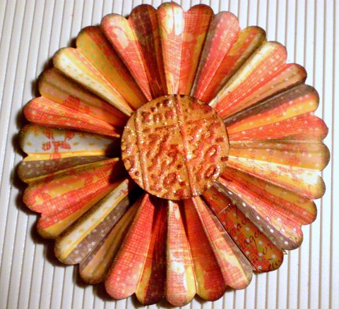
How completely GORGEOUS is this flower rosette?!  I have been admiring these paper rosettes for a while now, on other people's blogs.  I've seen tutorials on how to make them, and I've seen Tim Holtz's new Sizzix die cut that makes it super easy to make the rosettes.  My super-sweet hubby gave me a Michael's gift card this weekend, and I was able to get a few hours of ME time this weekend, so I spent some time wandering the aisles of Michaels, loving their new-and-improved selection of Tim Holtz products.  Anyway, they do not have the new rosette die...but I was thinking that I might want the Martha Stewart score board anyway, so that I could make multiple sizes of rosettes...so I got one!  Additionally, I did find a pair of Tim Holtz Sizzix embossing folders (the one with the notebook page and the numbers collage).  My first few attempts at making the rosette failed, but after watching this YouTube video, I finally got it right (AND got the idea to scallop the edge before scoring the paper, which I LOVE, anyway).


I don't remember the name of the paper pad this sheet of paper is from.  I used a scallop-edge punch from Stampin' Up!.  For the center of the rosette, I used the numbers collage embossing folder to emboss a sheet of mustard-colored cardstock.  I then used distress ink pads direct-to-paper to rub over the raised portions (colors used - Barn Door, Spiced Marmalade, Vintage Photo).  I punched out a circle, and inked around the edges with Walnut Stain, then glued it onto the rosette.  I also used Vintage Photo and Walnut Stain distress inks with a foam ink applicator to apply ink to the scalloped edges of the rosette and the raised "mountains" of the rosette.  Finally, I added some Scattered Straw and Spiced Marmalade colored Distress Stickles over the  embossed center of the rosette to give it a bit of vintage sparkle.  


Can you see that gorgeous sparkle from the distress stickles?  I LOVE them!!!  They are more matte and muted than regular stickles, and have a more vintage look to them.  They are quickly becoming a favorite of mine!!  I think I have 9 colors now...but STILL haven't found the ONE I've been searching for - Rock Candy!!  Anyway, I can't wait to make more of these rosettes and put them on some fun projects!!  (Or even make a project out of just the rosettes...can you see a rosette garland in your mind??)
*******************************************************


This next project is one I did with the kids, and I got the idea from here.  I free-hand drew the tree onto kraft paper and used removable glue dots to stick it to the slider doors.  I used recycled (i.e. the brown ones, not ones I've used!) coffee filters, and I sprayed them with water before the kids began painting them.  Rather than use watercolors (which the twins tend to really dig the paintbrushes into), I just watered down some tempera paints.  They had a blast - especially Mackenzie, who dumped the bowl of orange paint not once, but twice!  I let the coffee filters dry, and then cut various sizes and shapes of leaves out of them.  The kids then helped me stick them to the slider door...on the tree, and falling down to a "pile" near the bottom.


I love the colors of the leaves, and the way they seem to have a stained-glass effect against the outdoor light.  AND, as a bonus, while it was VERY hot all week, like magic, today it was wonderfully cloudy and cool!!  It was almost as if putting up the "fall tree" brought with it some "fall weather."  :)  If only the fall weather would stick around!!


*******************************************************


This final project is a simple little tag I made using another paper flower technique.  It was originally designed to be made using Tim Holtz's grungepaper, but not having any yet, I've been using cardstock.  I first made them on my fall banner, but since then, have learned that coating the flower pieces with Mod Podge on both sides before assembling the flowers actually helps a lot in helping the flowers keep their structure and gives them a really cool leather-like texture.  To make this tag, I started with a piece of pale yellow cardstock.  I cut the tag on my Cricut, and used an EK Success edge punch along the bottom.  I cut a 1/2" circle using a punch, out of the same paper I was using for the flower, then used a 1/4" hole punch to punch the center out of it, thus creating a "hole reinforcement" for the hole at the top of the tag - a technique I learned during one of the many tutorials I watch.  I then used 3 leaves I cut from my Cricut as masks, around which I applied several colors of distress inks and some Glimmer Mist in tiger lily.  


Finally, I stamped "gratitude" along the bottom, and tied a ribbon through the top.  I inked the edges of the flower with a little distress ink before gluing it to the tag, and that was it.  I sent the tag off with a note of thanks to a mama who had loaned a baby wrap to me for a while.


OH - I also did a page in my Inspiration Journal...I'll post that sometime this week.  And yes, I realize I didn't post an Inspiration Wednesday post last week.  I just didn't get a chance to work in my Inspiration Journal last week...but I made up for it this weekend.  :)

What about you?  Did you have a creative weekend?  I'd love links to whatever you created, if you did!!

Thursday, September 30, 2010

Visions of Fall


Ahh...well, it was triple digits all weekend long, but that didn't stop me from finally getting out all of my fall decorations and turning the INSIDE of my house into an autumn oasis!  Each year, I seem to accumulate a little bit more (which is fine by me, since this is my favorite time of year!)...so every year, the house looks just a little different.  It's always fun to figure out just where everything should go, and which things can be placed within the reach of my little grabby-handed twins without ending up damaged (and without the hands getting hurt).  


These are the only things that ended up in the girls' reach: a floral bouquet in a tin vase, and two foam pumpkins that we carved last year.  And while they were enthralled in the beginning and wanted to cart the pumpkins off to play with them, a warning that they might get put away was enough to make Makayla start keeping her sister in check whenever she sees her starting to touch them again!  


It was nice to find a more permanent home for my new fall banner, too (rather than on the blinds in my craft room).  It looks quite nice in the family room over the windows.  


And finally, a gorgeous arrangement on the island.  While it may not FEEL like fall outside, it can at least SMELL like fall inside!


Now I just need some more fall artwork from the kids to finish decorating the walls and windows!!  How do you and your family celebrate the changing of the seasons?  

Tuesday, September 28, 2010

Tim Holtz Product Giveaway at Scrap with Stacy


If you've been reading here long at all, you know how much I *love* all things by Tim Holtz!!  If you'd like a chance to try his products out for yourself, jump over to Stacy's blog at Scrap With Stacy - she's having an awesome giveaway of Tim Holtz goodies, and it's open until October 31!!  So you have PLENTY of time to enter the giveaway.  Just click here (or the link over on my sidebar) to be taken to her link for the instructions on how to be entered.

Wednesday, September 22, 2010

Inspiration Wednesday 09/22/2010


Oh my - I'm actually posting my Inspiration Wednesday post ON Wednesday!  And well before midnight!  LOL!!  That would be because A.) I started my page before Donna posted hers, and thus, B.) did not wait until so late in the day to start; and C.) did a more simple page this week.  That said, it was a VERY difficult page to photograph (although it does seem like MOST of my stuff is hard to photograph well with my camera)...indoors, the flash shone off the Glimmer Mist and acrylic paint of the leaves so brightly, yet outdoors in the natural light, I couldn't get the Glimmer Mist to sparkle hardly at all.  So I did my best to share some of both...so hopefully you can get a feel for just how shimmery and warm this page really is!

I was glad I didn't wait for Donna to post hers this week, since I don't actually own any Pan Pastels (or any pastels, for that matter)...so I wouldn't have been able to do that part of the technique anyway.  I just did a simple coat of Ochre Yellow fluid acrylic paint (Golden brand) for the background.  I literally just put a couple drops of it right on the page, sprayed some water on the page, and used a wide brush to spread the paint over the entire page, letting it lighten toward the left part of the page.  Then I took 3 leaves I had previously cut from book text, using my Cricut (the Wild Card cartridge), and glued them down on the page.  I painted over them using Nickel Azo Gold fluid acrylic paint, building in layers, so that it is darker on the outer part of the leaves.  I love that you can see the brush strokes and the layers in some of the pictures - and that you can still see the book text through the paint - the leaves almost seem to have a 3-dimensional look to them.  


Then, I used a mask that I had cut on my Cricut (also Wild Card cartridge), using the Tim Holtz cut-your-own-mask sheets - that's the tree branch you see near the top of the page.  It's self-adhesive, so I stuck it to the page, and used my Tim Holtz distress inks in Orange Marmalade, Barn Door, and Vintage Photo over the  mask and around the edges of the entire page, before removing the mask.  I also went around the edges of the page with a little Walnut Ink distress ink.  I stamped the clock face using an acrylic stamp I made using the  cut-your-own-stamps acrylic stamp sheets for the Cricut (using the Graphically Speaking cartridge), in brown Staz-on.  I then used the same cartridge to cut clock hands from cardstock and glued them on top of the stamped image, and covered them in Glossy Accents, and glued the Tim Holtz metal "cherish" charm in the middle.  I stamped "gratitude" at the bottom of the page, and glued down two pieces of ruler ribbon on the page.  I spritzed the page with Tiger Lily Glimmer Mist - a gorgeous shade of orange with beautiful golden shimmer to it.  Finally, I added my quote and doodled a few lines around the edges using black india ink.


I love how this last photo shows the texture of the leaves!!  They were so simple to do, but I just love them!!  They make me happy!

LinkWithin

Related Posts Plugin for WordPress, Blogger...