I also got to use my new Spun Sugar Distress Stain on the tag, plus Distress Inks in Victorian Velvet, Crushed Olive, Vintage Photo, and Walnut Stain.
Showing posts with label heat embossing. Show all posts
Monday, March 28, 2011
Sewing Tag using Distress Stain and Embellie Gellie
Just a quick post to show you a little sewing-related tag I made today using some vintage sewing pattern material and vintage buttons. I also used a new accessory called Embellie Gellie by Scraperfect - check out my review coming tomorrow on Craft Test Dummies!
Wednesday, February 23, 2011
Scrapbook Layout Using Crafter's Workshop Template
I recently had the opportunity to try out some templates from Crafter's Workshop for the first time. Now, I know what you're thinking...templates, stencils..."Aren't those SOOOO 1980's?!" I thought so too...until I started playing with these! These templates (or stencils - whatever you'd like to call them) are contemporary, versatile, and affordable. Check out my full review of them, as well as other techniques to use with them, on Craft Test Dummies tomorrow! To see even MORE techniques and read Jenny's review (THE Craft Test Dummy!!), go here. AND, she even includes a link to a great video full of techniques using these fabulous templates.
But today, I wanted to share this scrapbook layout I made using the 12"x12" template called Birds of a Feather. And since I have such a hard time just showing you what I made...I'm going to do a little tutorial to show how I made the background, as well as another cool technique!
I started with a vanilla-colored piece of smooth cardstock under the template, and pulled out my Distress Embossing Ink Pad by Ranger. I love this pad, because it's extra "juicy." I applied the ink pad directly to the template, pushing down and "squishing" a bit in the more detailed areas. I decided to only use 2 of the bird houses - and this is part of what I love about these templates...if you only want to use part of it, you totally can! I removed the template and sprinkled clear embossing powder over the ink, then embossed with my heat gun.
But today, I wanted to share this scrapbook layout I made using the 12"x12" template called Birds of a Feather. And since I have such a hard time just showing you what I made...I'm going to do a little tutorial to show how I made the background, as well as another cool technique!
I started with a vanilla-colored piece of smooth cardstock under the template, and pulled out my Distress Embossing Ink Pad by Ranger. I love this pad, because it's extra "juicy." I applied the ink pad directly to the template, pushing down and "squishing" a bit in the more detailed areas. I decided to only use 2 of the bird houses - and this is part of what I love about these templates...if you only want to use part of it, you totally can! I removed the template and sprinkled clear embossing powder over the ink, then embossed with my heat gun.
Next, I started applying distress ink over the embossed areas - the embossed areas resist the ink and will stay vanilla. You can use a damp cloth to wipe over the embossed areas to clean off any wet ink.
Isn't that just awesome?! I love this technique! I continued adding ink colors until the entire page was covered and I was happy with it.
| Distress ink colors used: Crushed Olive, Broken China, Tumbled Glass, Stormy Sky, Wild Honey, Vintage Photo |
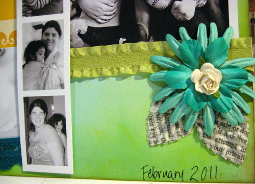
Next, I thought about what I wanted the page to be about. I decided to scrap about ME - which I never do, and so went searching for photos of me. Finding them was difficult - I'm always the one TAKING the pictures...but I eventually found a few and chose which to include. I decided that since I wanted the colors of the page to really shine, I made the photos black and white.
| Black & white photos show off the colors of the page |
I began adding embellishments - some of which I've had in my stash for years! It was nice to finally be using them. The title and butterflies are all from Marcella by K&Co.
| Title and butterflies from Marcella by K&Co. |
I wanted to add some bling, and I had a sheet of Prima Say It In Crystals. But I didn't want them to be clear - I wanted them to coordinate with my page. Fortunately, I knew just what to do!
First, I have been saving the plastic inserts from certain Tim Holtz Ideaology packaging...because they make great palettes for alcohol inks. So I added just two drops of each of the three colors I wanted to use into each well of one of these plastic inserts. I let the ink dry. I took one of my Pentel water brushes (to see a great review of water brushes, check out this one at Craft Test Dummies) and, empty of water, filled it with some alcohol blending solution. Then, I was able to use my brush to pick up the ink from my homemade palette, and color the bling just the way I wanted it.
| Blending solution-filled water brush, picking up color from dry alcohol ink on plastic package insert |
| Color your bling any color you like using alcohol inks! |
| Perfectly colored bling! |
I added some Prima flowers, and some really fabulous newsprint leaves I found at Michael's. For the center of the orange and blue flower, I used my Epiphany Crafts Shape Studio to make an epoxy flower center from a piece of book text. I added some trims from my bucket-o'-trims - and have no idea what brand they are.
| Flowers by Prima; newsprint leaves by Recollections from Michael's |
| Flowers by Prima; epoxy center made using book text and Shape Studio by Epiphany Crafts |
Finally, I added my journaling using a dip-pen and black india ink. I know the dip-pen may seem intimidating, but I find india ink to be the absolute best for writing over ink or paint.
| Journaling done with dip pen and india ink |
I love my final result, and I especially love that I created the background paper myself! I hope you've enjoyed my little tutorial - let me know if you have any questions!
Saturday, December 11, 2010
12 Tags of Christmas - Day 9!! (yes - out of order)
I had the grandest of plans to keep up with Tim's 12 tags...well, actually, I didn't...I knew better. That's why I was surprised when I got the first 2 done!! LOL! Not only is it hard to find adequate time, but I'm working with a limited "Tim" stash, which thus requires an extra amount of ingenuity - which is also time consuming. Not that I don't enjoy the challenge - really, I do - it totally stretches me creatively - but between trying to finish up the semester of homeschooling, taking care of a newborn, getting ready for Christmas, and participating on two design teams for the first time ever this month...my extra creative time has been very limited.
Anyway, all that said, I decided to quit thinking I needed to "catch up," and just pick up where I felt like it. Tim is actually finishing up tonight with his 12th and final tag. I was able to find the time to do tag #9 a couple nights ago, and am really happy with how it came out, so I wanted to share it with you. I do still hope to get the rest of them done in the next couple weeks...so we'll see!!
You can see Tim's tag #9 here, if you'd like to compare mine to his.
I can't wait to see what he comes up with for the 12th and final tag for this year's series. What a treat it's been to watch his mastermind creativity at work!!
Sunday, October 17, 2010
Halloween Fright
I really haven't been much into Halloween in the past, but for some reason, this year I've had more fun playing with all the fun Halloween papers, accessories, tools, and color themes!! And even though I don't typically like the whole "scary" aspect of the holiday, and for my kids, I definitely keep it more fun and lighthearted, for my projects, I have not been drawn to the more whimsical papers and colors...but the darker, spookier colors instead. With that said, I present my Halloween Fright wall hanging.
I am linking this to the Compendium of Curiosities Challenge #17 - Fragment Charms, as well as this week's Simon Says Stamp and Show challenge, "Show Some Metal."
This started with an 8x8 sheet of patterned paper from a Recollections Halloween pad from Michaels. I ran the paper through my Zutter Distrezz-it-All just mildly, and inked the edges with Spiced Marmalade distress ink. I took a sheet of white cardstock and embossed it using Tim Holtz's Halloween Fright texture fade. I then used distress inks to add color, and covered portions of it in Rock Candy crackle paint. I decided I wanted to place this piece behind the crow on the patterned paper, so I used a craft knife to carefully cut around the crow. I then used an embossing pen to cover the crow, and heat embossed it with black embossing powder. I used Lettuce alcohol ink to color a pearl sticker accent for the crow's eye.
For the Compendium of Curiosities Challenge this week, I had to make a Fragment charm - which is the clock. I can't share the details of how I made it, per the rules. :) I attached a couple jump rings, and then a swivel clasp - showing some metal - which was the challenge for Simon Says Stamp and Show. I attached the swivel clasp to the header on the layout with a brad. The brad was originally bright sparkly purple and silver - which would NOT have fit in - so I covered it with some Pitch Black acrylic dabber paint, and it had the perfect effect.
The title piece started as a blank white piece of watercolor paper. I used a technique called "block inking." I first applied Spiced Marmalade distress ink all over an acrylic stamping block, and then went around the edges with a darkish purple dye-based ink (I don't have a purple distress ink yet). I then spritzed the block a few times with water, and then placed it down on the paper. I pushed it down until the paper was completely saturated under the block, and then carefully lifted straight up. I then used a cloth to blot the excess puddles of ink off the paper, and used my heat gun to dry the paper. I then used my Distrezz-it-All to distress the edges of the paper, and used distress inks to add color to the edges all around, then glued the header to the background paper. I stamped "Happy Halloween," using a dark purple dye-based ink - with a stamp I had cut on my Cricut.
I took two small skulls from the minis set of grunge board, and wanted to paint them with metallic dabbers; however, neither the gold, silver, or copper seemed to fit with the bronze colored swivel clasp. So I mixed some copper and black on my craft mat, and got almost a perfect match, then used my finger to apply the paint to the grunge pieces. I attached both to their respective places with the Tim Holtz Tiny Attacher (seriously - BEST little stapler EVER!).
I added a piece of velvety bat trim (Recollections from Michaels), and made a rosette out of a piece of Donna Salazar's Crafty Chronicle using the Martha Stewart scoring board. (If you've never seen Donna's Crafty Chronicle - you seriously NEED to! It's like a newspaper, but not...it's all crafty articles and tutorials, on acid-free newsprint paper, intended to be read and then used for flowers and such! She even has a new one out just for Christmas, called Musical Memories! So fun!) I spritzed the rosette with Tiger Lily Glimmer Mist and some homemade purple glimmer mist, then cut out a couple nesting circles of purple and orange cardstock for the center. Finally, I stapled the second painted grunge board skull to the center, and used hot glue to attach the rosette to the entire piece.
To finish it off, I used the Tiny Attacher to add a few "stitches" along a couple sides. I decided the piece should be a wall hanging, so I backed it with a pieces of cardboard, and added a piece of wire and tied a few pieces of coordinating tulle and ribbon and fibers around the wire.
Tuesday, September 07, 2010
Finally - last week's Inspiration Journal work!!
Seeing as TOMORROW is Inspiration Wednesday already...I figured I'd better hurry up and get LAST WEEK'S entry in my Inspiration Journal posted!! I have been so busy being creative that I haven't had the time to sit and edit pictures or blog about them. Hmm...must figure out better scheduling so that I can fit that in.
So last week, Donna introduced us to her AMAZING array of watercolor crayons - hers are Caran D'Ache watercolor crayons, which look positively wonderful and I hope to try them one day soon. I have, in my stash, two tins of Stampin' Up! watercolor crayons - so I was at least able to play with the technique, if not necessarily get the exact same quality of results (for example, mine wouldn't maintain color over gesso, like hers did). Anyway, I loved this technique SO much - I had never used my watercolor crayons like this. Mainly, I had used them for coloring in stamps - such a limited use!! This was WAY more fun!! I loved how they blended together, and I love how the crayon strokes just disappear completely when you add the water and start painting.
Like Donna did, I started out with a bit of clear embossing, to give some resist once I added the watercolor crayons. The stamp I used ended up being too fine in detail, so much of it just looks like large areas of embossing powder - but lesson learned. It still looks pretty cool, I think. I also used one of my new EK Success (Michael's had them 40% off) edge punches along this side - LOVE the look!!
On the first side of the insert, I continued the color scheme and the quote (which I got off of a Tim Holtz stamp), added a Donna Downey canvas tab (using my Tim Holtz Tiny Attacher), and added a Tim Holtz acrylic tile which I backed with coordinating patterned paper. I outlined the insert using my india ink pen (as I did most of this entire entry).
On the second side of the insert, I liked the bird idea, so I cut one from chipboard using my Cricut, glued it to the insert, and gesso'd the entire insert. This time, for some reason, the watercolor crayons DID work (while on my main page, the gesso resisted the crayons). I love how you can still sort of see the lines behind the paint and gesso - it was originally a receipt-tag or something like that. I printed the word "dream" on my Brother labeler, cut the letters apart, and stuck them on the bird, then outlined everything with my india ink pen. I added a few Prima flowers and the orange ball trim (all of which had arrived JUST THAT DAY in some AWESOME grab bags from Donna Downey's website). (Read: If you ever get the chance to get one - or four - of those $5 grab bags - they are so TOTALLY worth it!!!)
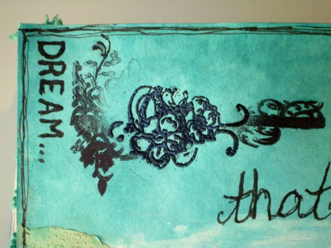
In the upper left hand of the left page, I attempted to stamp a floral-divider kind of stamp by Tim Holtz. But despite a couple times of trying, I could not get the center of the image to stamp well. So...I was innovative...and took a different stamp (Prima, I think?)...which was also floral and similar in look...I inked with Versamark, and heat embossed with black embossing powder. Then I used my india ink to write "Dream" along the edge. Overall, I ended up loving the look. Happy accidents...they are the best!
On the lower part of the left page, I added part of a paper doily (also from a grab bag), which I had spritzed with Glimmer Mist and then rubbed over with some light brown chalk ink. I ran the doily through my Xyron 900 to add adhesive to the entire back easily, rather than messing around with any kind of wet glue for such a delicate piece. I stamped the umbrella man and word quote in charcoal chalk ink, but wanted the words to be bolder, so I went over them with india ink. (Note - behind the words, you can see some of the drippage effect, from when I sprayed the page with water after I painted the watercolored areas - SO cool!!) I, of course, had to finish up by adding a tag with the date.
So, tomorrow is another Inspiration Wednesday! I'm just going to go ahead and say it - I probably won't get mine posted ON Wednesday! LOL I did do lots of creative things over the weekend, so hopefully I can get some of those things posted soon too.
Have YOU been playing and being creative???
Subscribe to:
Posts (Atom)