Showing posts with label Donna Downey. Show all posts

Saturday, February 19, 2011

Compendium of Curiosities Challenge #32

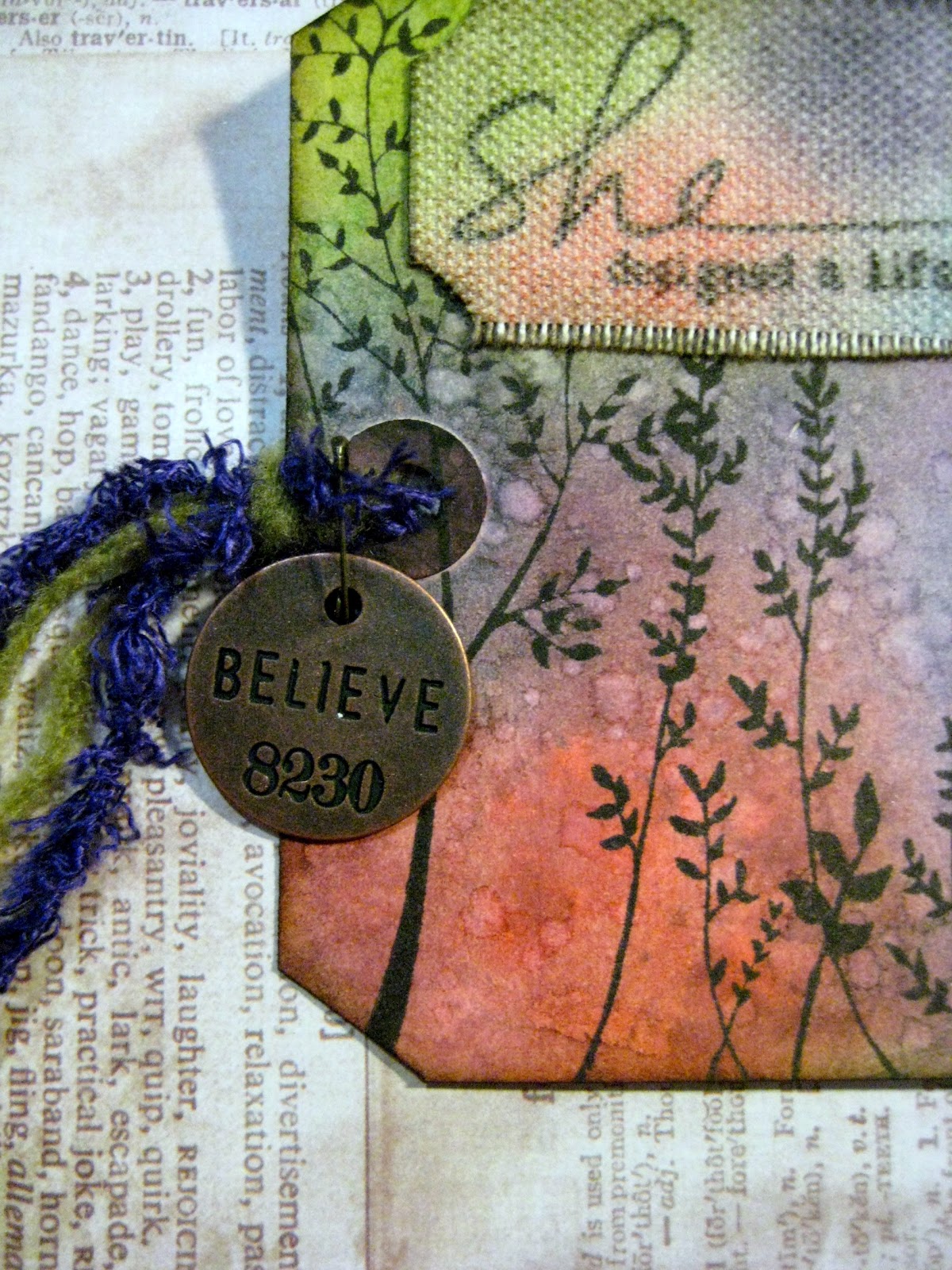
It's been a few weeks again since I've been able to participate in the weekly Compendium of Curiosities Challenge hosted by Linda over at Studio L3, so I was super happy to get some artsy play time in today!!  I loved the technique for this week's challenge - it's one I've done before, so this wasn't actually my first time trying it (for once!).  It's an easy but fun technique which always creates beautiful results.  I decided to incorporate my "One Little Word" for the year, believe, into my tag, since I haven't done anything related to my word lately...though it HAS been on my mind a lot.  And I just ADORE this quote, from a Donna Downey stamp - "She created a life she loved."

And as luck would have it, the challenge this week at Simon Says Stamp and Show is to create a tag, which I honestly didn't even know going into this creation...but since that's exactly what I did, I'm entering their challenge as well!!


Monday, October 18, 2010

She Dreams card - generation stamping technique


This is the second card I made for the second week of the Holiday Thinking Inking class on 2 Peas.  I really LOVED the card Jennifer made in her video - you can see it here, along with the instructions for this technique.  I, however, don't have a tree in my stamp collection that would work for this technique (note to self - get one!).  So it took me a minute to figure out what I was going to do for this challenge...and then I remembered my bird from this Donna Downey set.  I knew they would be perfect.  I also knew this quote would be perfect; it's from a different Donna Downey set.  It reads, "She pursued big dreams instead of small realities."  LOVE THAT!  


I won't go through the entire technique, since I linked to the PDF with the instructions above.  I will tell you that I used Spiced Marmalade distress ink for my birds, and since I didn't have any purple distress ink yet, I used another dye-based purple ink with a water-brush to do the water-coloring around the birds.  I used a Stampin' Up! script background stamp (probably retired by now) over the birds and purple background.  I layered the stamped/painted piece on a gorgeous piece of patterned cardstock from the K&Co Que Sera Sera paper pad, and then onto a vanilla-colored card.  I wrapped linen thread around the card front several times before tying it off and adding a Tim Holtz philosophy tag to finish it off.


My fingers have been very inky lately.  What about yours?

Thankful Card with Ink Bleeding Technique


I am participating in a free inking techniques class on 2 Peas given by Jennifer McGuire, called Holiday Thinking Inking.  (I actually missed the first week, though I did watch the videos, and jumped right in during the second week - so you can jump in NOW too!)  The instruction videos are posted both on Jennifer's blog and on 2 Peas, but you need to upload your challenge entries to your gallery on 2 Peas.  
Anyway, I made this card as part of the second week's challenges, using a technique called "ink bleeding."  This technique is shown here on the leaves.  I stamped a leaf (unknown brand) onto watercolor paper using distress ink, then spritzed the stamped image with water a few times to allow the ink to bleed.  Once I got the desired effect, I used my heat gun to dry it and stop the bleeding.  I repeated this two more times with different colors.  It is an especially nice effect for leaves, as it gives them a "veiny" look.
After the leaves were completed, I carefully cut them out, and used some Vintage Photo distress ink around the edges of them to give them more depth.  I also applied some Antique Linen with a foam ink applicator over them to soften the look.  Finally, I added some color-coordinating distress stickles to each one and dried  them with my heat gun.  (Note: do not heat regular Stickles with a heat gun, as it will bubble - only Distress Stickles are formulated to be able to withstand heating.)


Next, I started on the card.  I cut a piece of cardstock that was 9"x6.5" and scored it slightly off the middle lengthwise, so that when I used the scallop punch on the front, the front and back would line up.  After using the scallop punch along the long side of the front, I used distress inks to add some color on all 4 sides of the front of the card.  I added a strip of Tim Holtz Nostalgic tissue tape along the folded side, and colored it with distress inks (LOVE the tissue tape - you've GOT to try this stuff!!).  I found that my finger was the best bet for applying ink to specific spots on the tape.  

Then I used my brand new Spellbinders Nestabilities Labels 14 - which I've been lusting after for a VERY long time and just got in on Saturday - to cut two sizes from two coordinating pieces of DCWV patterned paper.  I added some Vintage Photo distress ink around the edges of the larger one and glued it down lengthwise on the card.  I added distress ink to the smaller one, as well, all over, and then stamped my sentiment using brown Staz-on ink.  I then used my copper Adirondack Paint Dabber to go around the edges of the smaller one to highlight it.  I used foam squares to pop up the sentiment label and adhered it horizontally over the larger label.  


Finally, before I was ready to adhere my leaves to the card, I felt the bottom of the card needed something, so I used a large flourish stamp (Donna Downey for Unity) with Spiced Marmalade distress ink (masking the tissue tape so as not to stamp over it) to add a background.  I then used foam squares to adhere the leaves, using different levels of squares so the leaves are not all popped up at the same height.


You can see the incredible, vintage-feeling sparkle the distress stickles add to the leaves.  I just love them!!


I hope you feel inspired to make something inky or showing gratitude yourself!  And come join me in the Holiday Thinking Inking class - we are only starting week 3 of 8, so there are still plenty of inky techniques for you to learn and try out!

(P.S. I still have one more card to show you from week 2!!)

Monday, October 11, 2010

Un-blogged Inspiration Journal pages

You've probably noticed that I haven't posted an Inspiration Wednesday post in a couple of weeks.  Why not?  Hmm...I don't really know, other than I've just been playing more with shipping tags and paper rosettes and distress inks than in my inspiration journal, I guess.  So it's not that I haven't been playing creatively, it just hasn't actually been in the journal.  

I did actually do a page, though, last weekend (Oct. 2), that was based on Donna's Sept. 29 video.  I just never got around to posting it!  Ha!  So...here is that page...you'll notice that again, I did almost the exact technique that Donna did.  I still don't have the same watercolor crayons as she does, so I have a very limited color palette in mine, but they still let me have the opportunity to play.  And I must say, I do love them every time I play with them...there's just something SO cool about watching those crayon lines turn into paint right before your eyes!


I did not, however, use black and white india ink for my twisty line, like Donna did.  I used black and white Galaxy markers (by American Crafts) for my line...for the finishing of it, I mean.  I started off with a charcoal pencil like she did.  I love my main quote - taken from a Tim Holtz stamp - "Not all who wander are lost."  I don't think I even own that stamp - yet - but I love the quote.  Around the twisty line, it says, "Art washes away from the soul the dust of everyday life. ~Picasso~  Be...Create...Risk....  Creativity is an endless journey where we should always take the scenic route.  Explore...Journey...Art."

***********************************************

This second entry which I never posted was one I did back in August, during a weekend when I was on bedrest for several days due to an injury.  I have spent many months on bedrest in the past - during each of my pregnancies, I was on bedrest for 3 months, due to preterm labor - but it was much easier to swallow then, given that I had a LOT at stake!  This time, with 3 young children to care for, and to be honest, a GIANT need to be downstairs in my crafting studio - NOT upstairs in bed! - I was most definitely having a pity party for myself!  Donna was on vacation that week, I believe, and had done her Inspiration Wednesday video on the road, using her india ink/pen and watercolor crayons or pencils to paint flowers in a book.  I didn't do anything that day, but over the weekend, I realized there was no reason I couldn't take MY fountain pen, watercolor crayons and my Stampin' Up! aqua painter brushes upstairs to my bed.  I already had this page in my inspiration journal with book text embedded, using gel medium, and a light wash of paint over it.  I figured it was the perfect page for me to draw some flowers and color/paint them in.


I also colored the inclusion page next to it, which happened to be a yellow envelope...and found that they tend not to take watercolor paint very well...as you can see by the muddy-sort of color.  I used my india ink to write my self-pity over it, "Bedrest sucks!  [especially when you're not even pregnant!]  Is there a flower to go with that?!"


A few days later, once I was cleared from bedrest by my doctor, I added the ribbon to the main page, as well as the black die-cut fence, since I felt like it sort of went with the pity-party theme much better than, say, a white-picket fence would.  I also added the journaling note-page with the caution, "Warning: Pity party up there."  I added a few black line-drawing rub-ons and painted them in too.  Ahh...well, it IS supposed to be part art, part JOURNAL, right?!

Saturday, October 09, 2010

CCC #16 - Wrinkle Free Distress


This is my first week joining the Compendium of Curiosities Challenge (CCC), hosted by Linda of Studio L3.  Each week (or in this case, two weeks, as many of the participants have just spent the last week on a cruise with Tim Holtz himself!), Linda posts a challenge using one of the techniques presented by Tim in his newest idea book.  You should DEFINITELY check out Linda's blog - her artwork is amaZING!!!

So, to start off, I knew I wanted to do a tag - but I don't currently have any size 8 tags.  I do, however, have grunge paper.  Many of my friends, who are not Tim Holtz addicts like I am, may not know quite what grunge paper is, exactly.  It's not really paper, and it's definitely not chipboard.  It's hard to describe - but it's sort of got this leathery feel (and smell!) to it, and it's very flexible!  It inks, paints, cuts, distresses, etc., just like you can do with paper.  It is VERY cool stuff!  So, knowing the dimensions of a size 8 shipping tag, I made my own from grunge paper - complete with cardstock hole reinforcements.  :)

Here are a few photos to show you the thickness and flexibility of grungepaper.


You can see that even after folding down the corner, once I release it, there is no crease mark at all, thanks to the qualities of the grunge paper.

So, onto the tag itself.  While I cannot tell you about the actual challenge technique (out of respect for Tim and  his book and copyright issues), I can tell you about the rest of the tag.  :)  I used my Zutter Distrezz-it-All to distress the edges of the tag, and then used Walnut Stain distress ink to ink the edges.  I stamped a Donna Downey-Unity stamp quote onto the upper right side, using brown Staz-on ink - I love this quote!!  I threaded multiple earth-toned fibers through the hole at the top of the tag.


At the bottom of the tag, I laid a piece of natural-colored magic mesh (remember that stuff???) that has been in my stash FOREVER!!  Then I took a piece of thin brown paper (it actually came from a box of goodies I received - it was packing material paper), and spritzed it with homemade red and green glimmer mists, and Tattered Angels tiger lily Glimmer Mist.  Then I put down a line of Beacon 3 in 1 craft glue, and gathered the paper into pleats while adhering it to the bottom of my tag.  I took a piece of mustard-colored cardstock the width of my tag, used several colors of distress inks on it, and added some distress stickles to it, before gluing it over the top of where the pleated paper was glued to the tag.  I then used deckle scissors to cut off the misted paper to the length I wanted it.  Finally, I cut a 1"x12" piece of cardstock from Tim's Lost & Found paper pad, and used my Martha Stewart scoring board to score it every 1/4".  I then folded it accordian-style, cut off one piece, used my Tiny Attacher to join the ends together, and pressed the center down to form a rosette, using a hot glue gun to attach the rosette to a circle of cardstock on the back.  I cut another piece of cardstock for the front, used distress inks on it, added a smaller piece of patterned cardstock, with distress stickles on it, and glued those onto the front of the rosette.  I used Walnut Stain distress ink around the edges of the rosette and brushed it lightly on top of some of the peaks of the rosette, then used hot glue to attach it to the tag.  You can see the vintage sparkle on the cardtock above the ruffle, and the shimmer from the mists on the ruffle itself.


I used to wonder what the draw was in decorating "shipping tags."  Oh my.  Whatever was I thinking?!  LOL!!  I am SOOOO hooked!  There is SUCH gratification in creating a work of art in a relatively short period of time, and the tag is just such a wonderful medium to work with in doing so!  

And wow, these rosettes are TOTALLY addictive!  Don't be surprised in the least if they seem to show up on anything and everything that I make in the near - and not-so-near - future!!  ;)


Wednesday, September 22, 2010

Inspiration Wednesday 09/22/2010


Oh my - I'm actually posting my Inspiration Wednesday post ON Wednesday!  And well before midnight!  LOL!!  That would be because A.) I started my page before Donna posted hers, and thus, B.) did not wait until so late in the day to start; and C.) did a more simple page this week.  That said, it was a VERY difficult page to photograph (although it does seem like MOST of my stuff is hard to photograph well with my camera)...indoors, the flash shone off the Glimmer Mist and acrylic paint of the leaves so brightly, yet outdoors in the natural light, I couldn't get the Glimmer Mist to sparkle hardly at all.  So I did my best to share some of both...so hopefully you can get a feel for just how shimmery and warm this page really is!

I was glad I didn't wait for Donna to post hers this week, since I don't actually own any Pan Pastels (or any pastels, for that matter)...so I wouldn't have been able to do that part of the technique anyway.  I just did a simple coat of Ochre Yellow fluid acrylic paint (Golden brand) for the background.  I literally just put a couple drops of it right on the page, sprayed some water on the page, and used a wide brush to spread the paint over the entire page, letting it lighten toward the left part of the page.  Then I took 3 leaves I had previously cut from book text, using my Cricut (the Wild Card cartridge), and glued them down on the page.  I painted over them using Nickel Azo Gold fluid acrylic paint, building in layers, so that it is darker on the outer part of the leaves.  I love that you can see the brush strokes and the layers in some of the pictures - and that you can still see the book text through the paint - the leaves almost seem to have a 3-dimensional look to them.  


Then, I used a mask that I had cut on my Cricut (also Wild Card cartridge), using the Tim Holtz cut-your-own-mask sheets - that's the tree branch you see near the top of the page.  It's self-adhesive, so I stuck it to the page, and used my Tim Holtz distress inks in Orange Marmalade, Barn Door, and Vintage Photo over the  mask and around the edges of the entire page, before removing the mask.  I also went around the edges of the page with a little Walnut Ink distress ink.  I stamped the clock face using an acrylic stamp I made using the  cut-your-own-stamps acrylic stamp sheets for the Cricut (using the Graphically Speaking cartridge), in brown Staz-on.  I then used the same cartridge to cut clock hands from cardstock and glued them on top of the stamped image, and covered them in Glossy Accents, and glued the Tim Holtz metal "cherish" charm in the middle.  I stamped "gratitude" at the bottom of the page, and glued down two pieces of ruler ribbon on the page.  I spritzed the page with Tiger Lily Glimmer Mist - a gorgeous shade of orange with beautiful golden shimmer to it.  Finally, I added my quote and doodled a few lines around the edges using black india ink.


I love how this last photo shows the texture of the leaves!!  They were so simple to do, but I just love them!!  They make me happy!

LinkWithin

Related Posts Plugin for WordPress, Blogger...