Showing posts with label india ink. Show all posts

Wednesday, February 23, 2011

Scrapbook Layout Using Crafter's Workshop Template

I recently had the opportunity to try out some templates from Crafter's Workshop for the first time.  Now, I know what you're thinking...templates, stencils..."Aren't those SOOOO 1980's?!"  I thought so too...until I started playing with these!  These templates (or stencils - whatever you'd like to call them) are contemporary, versatile, and affordable.  Check out my full review of them, as well as other techniques to use with them, on Craft Test Dummies tomorrow!  To see even MORE techniques and read Jenny's review (THE Craft Test Dummy!!), go here.  AND, she even includes a link to a great video full of techniques using these fabulous templates.


But today, I wanted to share this scrapbook layout I made using the 12"x12" template called Birds of a Feather.  And since I have such a hard time just showing you what I made...I'm going to do a little tutorial to show how I made the background, as well as another cool technique!


I started with a vanilla-colored piece of smooth cardstock under the template, and pulled out my Distress Embossing Ink Pad by Ranger.  I love this pad, because it's extra "juicy."  I applied the ink pad directly to the template, pushing down and "squishing" a bit in the more detailed areas.  I decided to only use 2 of the bird houses - and this is part of what I love about these templates...if you only want to use part of it, you totally can!  I removed the template and sprinkled clear embossing powder over the ink, then embossed with my heat gun.


Next, I started applying distress ink over the embossed areas - the embossed areas resist the ink and will stay vanilla.  You can use a damp cloth to wipe over the embossed areas to clean off any wet ink.


Isn't that just awesome?!  I love this technique!  I continued adding ink colors until the entire page was covered and I was happy with it.  

Distress ink colors used: Crushed Olive, Broken China,
Tumbled Glass, Stormy Sky, Wild Honey, Vintage Photo

Next, I thought about what I wanted the page to be about.  I decided to scrap about ME - which I never do, and so went searching for photos of me.  Finding them was difficult - I'm always the one TAKING the pictures...but I eventually found a few and chose which to include.  I decided that since I wanted the colors of the page to really shine, I made the photos black and white.

Black & white photos show off the
colors of the page

I began adding embellishments - some of which I've had in my stash for years!  It was nice to finally be using them.  The title and butterflies are all from Marcella by K&Co.  

Title and butterflies from Marcella by K&Co.

I wanted to add some bling, and I had a sheet of Prima Say It In Crystals.  But I didn't want them to be clear - I wanted them to coordinate with my page.  Fortunately, I knew just what to do!  

First, I have been saving the plastic inserts from certain Tim Holtz Ideaology packaging...because they make great palettes for alcohol inks.  So I added just two drops of each of the three colors I wanted to use into each well of one of these plastic inserts.  I let the ink dry.  I took one of my Pentel water brushes (to see a great review of water brushes, check out this one at Craft Test Dummies) and, empty of water, filled it with some alcohol blending solution.  Then, I was able to use my brush to pick up the ink from my homemade palette, and color the bling just the way I wanted it.

Blending solution-filled water brush, picking up color
from dry alcohol ink on plastic package insert

Color your bling any color you like using alcohol inks!

Perfectly colored bling!

I added some Prima flowers, and some really fabulous newsprint leaves I found at Michael's.  For the center of the orange and blue flower, I used my Epiphany Crafts Shape Studio to make an epoxy flower center from a piece of book text.  I added some trims from my bucket-o'-trims - and have no idea what brand they are.
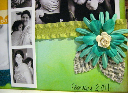
Flowers by Prima; newsprint leaves by
Recollections from Michael's

Flowers by Prima; epoxy center made using book text and
Shape Studio by Epiphany Crafts

Finally, I added my journaling using a dip-pen and black india ink.  I know the dip-pen may seem intimidating, but I find india ink to be the absolute best for writing over ink or paint.  

Journaling done with dip pen and india ink

I love my final result, and I especially love that I created the background paper myself!  I hope you've enjoyed my little tutorial - let me know if you have any questions!


Monday, October 11, 2010

Un-blogged Inspiration Journal pages

You've probably noticed that I haven't posted an Inspiration Wednesday post in a couple of weeks.  Why not?  Hmm...I don't really know, other than I've just been playing more with shipping tags and paper rosettes and distress inks than in my inspiration journal, I guess.  So it's not that I haven't been playing creatively, it just hasn't actually been in the journal.  

I did actually do a page, though, last weekend (Oct. 2), that was based on Donna's Sept. 29 video.  I just never got around to posting it!  Ha!  So...here is that page...you'll notice that again, I did almost the exact technique that Donna did.  I still don't have the same watercolor crayons as she does, so I have a very limited color palette in mine, but they still let me have the opportunity to play.  And I must say, I do love them every time I play with them...there's just something SO cool about watching those crayon lines turn into paint right before your eyes!


I did not, however, use black and white india ink for my twisty line, like Donna did.  I used black and white Galaxy markers (by American Crafts) for my line...for the finishing of it, I mean.  I started off with a charcoal pencil like she did.  I love my main quote - taken from a Tim Holtz stamp - "Not all who wander are lost."  I don't think I even own that stamp - yet - but I love the quote.  Around the twisty line, it says, "Art washes away from the soul the dust of everyday life. ~Picasso~  Be...Create...Risk....  Creativity is an endless journey where we should always take the scenic route.  Explore...Journey...Art."

***********************************************

This second entry which I never posted was one I did back in August, during a weekend when I was on bedrest for several days due to an injury.  I have spent many months on bedrest in the past - during each of my pregnancies, I was on bedrest for 3 months, due to preterm labor - but it was much easier to swallow then, given that I had a LOT at stake!  This time, with 3 young children to care for, and to be honest, a GIANT need to be downstairs in my crafting studio - NOT upstairs in bed! - I was most definitely having a pity party for myself!  Donna was on vacation that week, I believe, and had done her Inspiration Wednesday video on the road, using her india ink/pen and watercolor crayons or pencils to paint flowers in a book.  I didn't do anything that day, but over the weekend, I realized there was no reason I couldn't take MY fountain pen, watercolor crayons and my Stampin' Up! aqua painter brushes upstairs to my bed.  I already had this page in my inspiration journal with book text embedded, using gel medium, and a light wash of paint over it.  I figured it was the perfect page for me to draw some flowers and color/paint them in.


I also colored the inclusion page next to it, which happened to be a yellow envelope...and found that they tend not to take watercolor paint very well...as you can see by the muddy-sort of color.  I used my india ink to write my self-pity over it, "Bedrest sucks!  [especially when you're not even pregnant!]  Is there a flower to go with that?!"


A few days later, once I was cleared from bedrest by my doctor, I added the ribbon to the main page, as well as the black die-cut fence, since I felt like it sort of went with the pity-party theme much better than, say, a white-picket fence would.  I also added the journaling note-page with the caution, "Warning: Pity party up there."  I added a few black line-drawing rub-ons and painted them in too.  Ahh...well, it IS supposed to be part art, part JOURNAL, right?!

Wednesday, September 22, 2010

Inspiration Wednesday 09/22/2010


Oh my - I'm actually posting my Inspiration Wednesday post ON Wednesday!  And well before midnight!  LOL!!  That would be because A.) I started my page before Donna posted hers, and thus, B.) did not wait until so late in the day to start; and C.) did a more simple page this week.  That said, it was a VERY difficult page to photograph (although it does seem like MOST of my stuff is hard to photograph well with my camera)...indoors, the flash shone off the Glimmer Mist and acrylic paint of the leaves so brightly, yet outdoors in the natural light, I couldn't get the Glimmer Mist to sparkle hardly at all.  So I did my best to share some of both...so hopefully you can get a feel for just how shimmery and warm this page really is!

I was glad I didn't wait for Donna to post hers this week, since I don't actually own any Pan Pastels (or any pastels, for that matter)...so I wouldn't have been able to do that part of the technique anyway.  I just did a simple coat of Ochre Yellow fluid acrylic paint (Golden brand) for the background.  I literally just put a couple drops of it right on the page, sprayed some water on the page, and used a wide brush to spread the paint over the entire page, letting it lighten toward the left part of the page.  Then I took 3 leaves I had previously cut from book text, using my Cricut (the Wild Card cartridge), and glued them down on the page.  I painted over them using Nickel Azo Gold fluid acrylic paint, building in layers, so that it is darker on the outer part of the leaves.  I love that you can see the brush strokes and the layers in some of the pictures - and that you can still see the book text through the paint - the leaves almost seem to have a 3-dimensional look to them.  


Then, I used a mask that I had cut on my Cricut (also Wild Card cartridge), using the Tim Holtz cut-your-own-mask sheets - that's the tree branch you see near the top of the page.  It's self-adhesive, so I stuck it to the page, and used my Tim Holtz distress inks in Orange Marmalade, Barn Door, and Vintage Photo over the  mask and around the edges of the entire page, before removing the mask.  I also went around the edges of the page with a little Walnut Ink distress ink.  I stamped the clock face using an acrylic stamp I made using the  cut-your-own-stamps acrylic stamp sheets for the Cricut (using the Graphically Speaking cartridge), in brown Staz-on.  I then used the same cartridge to cut clock hands from cardstock and glued them on top of the stamped image, and covered them in Glossy Accents, and glued the Tim Holtz metal "cherish" charm in the middle.  I stamped "gratitude" at the bottom of the page, and glued down two pieces of ruler ribbon on the page.  I spritzed the page with Tiger Lily Glimmer Mist - a gorgeous shade of orange with beautiful golden shimmer to it.  Finally, I added my quote and doodled a few lines around the edges using black india ink.


I love how this last photo shows the texture of the leaves!!  They were so simple to do, but I just love them!!  They make me happy!

Thursday, September 16, 2010

Inspiration Wednesday 9/15/2010


As usual, I'm posting my Inspiration Wednesday work on Thursday - because by the time Donna gets HER video up, and I take care of all my homeschooling duties, children who need feeding, household stuff, etc...I just can't manage to get it all done (or posted) by the end of Wednesday!!  LOL  I suppose if I just did my own thing and started first thing on Wednesday mornings, I could...but what fun would THAT be?  I wanna try whatever technique Donna is demonstrating...so I wait for her to post her video and then I get to play along!!

So this week, we painted the background with fluid acrylics using a palette knife!  Totally a cool look!  I love the lines and texture it gives the background.  I didn't have the color of green I wanted, so I had to mix up some Hansa Yellow Medium, Phthalo Green (blue shade), and Yellow Ochre (all Golden fluid acrylics) to get just the right shade I was aiming for.  My pictures don't quite show it right - it's a little bit more olive-colored in real life.  My inspiration for the color was actually the shade of green in the patterned paper I used to make the flower at the bottom of the page (more on that in a bit).


I love this quote - it came from a women's devotional book I have.  I have been working with my 5-year old a LOT lately on focusing more on others' needs than on his own, and on paying more attention to giving than to getting - so this thought has been on my mind lately.


This twisted paper swirly thing - not exactly sure WHAT to call it - was something that Donna Salazar taught during her Tuesday Tutorial a couple nights ago (you should definitely check those out - free online video classes - live - every other Tuesday - there's a link on my left sidebar).  I tore three pieces of book text into about 2.5 inch-wide strips, coated them in Liquitex Gloss Medium & Varnish (she used a Beacon Fast Finish Decoupage, I believe), then gently twisted them one at a time.  I formed a peak at the top, and a sort of flattened part at the other end.  After forming all three and having curved them the way I wanted, I gently twisted all three together and smooshed the flattened bottom ends together, then laid them on my non-stick craft mat to dry.  Once they were dry (I used my heat gun to sort of speed up this process), I spritzed the now-one-piece swirly with some Tiger Lily Glimmer Mist and some homemade magenta colored shimmer mist.  It's hard to catch just how shimmery it really is, in photos - but let me tell you, it really shimmers!  I adhered it to the page using Beacon 3-in-1 Craft Glue (love that stuff!).


The bird, I cut out of the same patterned paper that I used to make this beautiful rose.  I outlined the bird using my dip pen and black india ink, just as I used for writing my quote.  Notice the eye of the bird - I added a drop of Glossy Accents to give it a dimensional look.  I also added several drops of the Glossy Accents to the flower petals to make it look like drops of dew or rain on the flower.  The Accents go on a little cloudy-looking, but dry crystal clear and very glossy, giving a very cool look.  Glossy Accents can also be used as an adhesive and will even adhere paper to metal.

Now - the flower!  This is my newest fun technique!!!  And SO easy it's ridiculous!  I still can't believe I never knew until now how to make these!  Can I just say how much I adore You-Tube?  You can really learn just about anything there - I've learned how to sew, how to knit, and many many other skills by watching videos people have posted on You-Tube.  Anyway, apparently this technique was originally a flower that Tim Holtz made using a Sizzix flower die; however, a very creative woman figured out a way to make them even faster using her Cricut and the George & Basic Shapes cartridge - which is the cartridge that comes with the orginal Cricut...the one I just happen to have.  However, I would imagine you could find a flower shape on MANY of the Cricut cartridges that would work with this technique.  THREE cut flowers is ALL it takes, a few snips of your scissors, some curling of the petals around a pencil or paintbrush, and a hot glue gun - and you've got yourself a GORGEOUS, 3-dimensional rose!  

So...that's this week Inspiration Journal entry.  I hope you enjoyed it...and I hope you do something to express your own creativity this week!  I promise you that the more you take the time to practice being creative, the more you will find your creative impulses exploding in your mind!!

Thursday, September 09, 2010

Inspiration Wednesday (er...Thursday...9/9/10)

I really thought it was just me...so I was really relieved to hear Donna say in her video this week that she often  thinks she's going to hate her Inspiration Journal pages in the beginning, but at some point during the process, she starts to love them.  Because that almost always happens to me, it seems.  I started this weeks' technique late last night, and continued early this morning...and stopped when this is what I had:


Don't hate...I can tell you are as enthusiastic about it as I was!!  LOL  Isn't it BEAUTIFUL?!  So let me back up just a bit and explain how I got there.  I started by using matte gel medium to basically decoupage the entire two pages with pieces of torn book pages.  The look was actually pretty cool - I should've taken a pic of THAT!  I left that to dry overnight (partly because it was after 1:00 a.m. when I finished, but mostly because my hubby would've been pretty unhappy with me for running my heat gun at that hour).  This morning, I woke early enough before we had to leave for Bible study that I was able to work some more on it.  Now, in Donna's video, she used Tattered Angel's new Glimmer Glaze.  I don't have any, and I don't have any money to buy any.  BUT, I do have this: 


AND...


So...my thought was that I could attempt to create my OWN version of Glimmer Glaze.  See my experimenting?  I was definitely getting shimmer!!


Donna did drippage with hers.  She used a paintbrush...which I tried, but I didn't really get the effect I wanted.  So I decided to try something different...after all, that's what this whole Inspiration Journal experience is about, right?  First I tried sponging it on.  It didn't really give the effect I wanted either.


So then I went to the kitchen and found a frosting bottle.  I put a couple buttons in the bottom to use for mixing "balls," then poured in some of the pearlized paint, some re-inker drops, and some glazing liquid.  And I shook and mixed.  And I tested.  And I added more color.  And finally I had the color and consistency I wanted...and I did drippage.  And I sprayed water.  And I heat gunned.


And after all of THAT, my paper was falling apart...leading me to have to add some packing tape to the middle of the centerfold...and fortunately, the paint mixture adhered over the packing tape.  And all of THAT is what got me to those pictures you see above...and where I left things when I went to Bible study, wondering what on earth I was going to do next!!

But by the time I got home, after spending a wonderful time in the fellowship of true friends and in God's word, I knew exactly what my pages were going to be about.  You see, my Inspiration Journal is not just about art or about me learning new techniques.  It's also about me, as a person, and where I am in my life.  It reflects my soul, my heart, the inner parts of me that sometimes simple words in a written journal just can't do.  And over the past few months, one of the toughest things I've had to deal with and one of the things that has caused me more tears and gripping heartbreak than just about anything else in my recent past is struggling with broken friendships.  I was upset just yesterday about something, and one of my dear friends reminded me, "A true friend loves at ALL times."  (Proverbs 17:17)  Not just when it's convenient.  Not just when it's easy.  And I am SO thankful for the friendships I have with genuine, authentic women, who put forth their true selves, who DO love me all the time, who are real and authentic, who don't wear masks or put on falsehoods.  And that's how this page evolved.  :)


I don't remember where I found the quote, but I have it written in a journal where I jot down quotes that I come across that I love.  The flowers are some discontinued Prima flowers that I received in one of Donna's recent grab bags.  The quotes are cut from a Nicole Nordeman book (can't remember the name at the moment).  The writing and drawing is done in india ink.  The stems are of various ribbons and twines.  

Tuesday, September 07, 2010

Worth it!


Some days, when I'm working on projects, it seems like nothing goes right.  Today was one of those days.  It started off to be a good, productive day.  Anthony and I were done with his homeschooling by 11, and he and the girls went outside to play - the weather was positively gorgeous!  So I had some quiet inside time, with all the windows open, to work on sewing.  I already had completed a dress that was to be a birthday gift that a friend of mine had ordered for her sweet to-be-5-year old daughter.  


I had also finished a scrappy flower matching hair barrette, which was a gift from me.  (Don't actually have a picture of that.)  Today I needed to complete the matching doll dress her mom ordered, and I wanted to make a scrappy flower pony tail for the doll, to match the dress, as a gift from me as well.

Right from the start, things just didn't go my way.  I wasn't using a pattern - since I didn't actually use a pattern for the little girl's dress - and all I knew of the doll was that it was an 18" doll - and I sort of assumed, since I knew the girl HAD an American Doll, that the dress was FOR the American Doll.  Oops.  So I had the side seams sewn and serged, when I vaguely remembered something about her mom trying to get some other type of doll for her daughter...and thought it might be a good idea if I could actually SEE the doll to make sure the dress I was making would actually FIT the doll before I went any further.  GOOD THING.  

She brought the doll over - which I immediately swooned over and fell head over heels in love with, by the way - and I was right...the dress didn't fit.  Since the doll was to be a gift, it was no problem to leave the doll with me...which she did...and I went to work.  First, I realized that besides being too tight, the dress was way too long...so initially, I tried to just shorten the existing dress and make it work.  Which would  have worked, had I not cut the arm holes unevenly.  Oops.  So I cut some more, and it was a little shorter than I wanted, but I thought I could still make it work.  So I went to do the rolled hem edge on the bottom.  Except my serger was doing something funky to the fabric and pretty much ruining it.  I tried adjusting tensions, etc., to no avail.  Well, shoot.  I adjusted some more, practiced on some scraps, again to no avail...and then it finally dawned on me.  While I had unthreaded the left needle - I had never actually removed it.  DUH.  So it was making an unnecessary and damaging row of holes in the fabric.  SIGH.  Scrap that dress altogether and just start over.

So I started over.  This time it went much better...and I took notes on my computer, just in case this mom (or anyone else) ever asks me again to make a dress for a Natural Buddies doll (and this ended up being a 16" doll, not an 18" one), so I never have to figure this out again!  

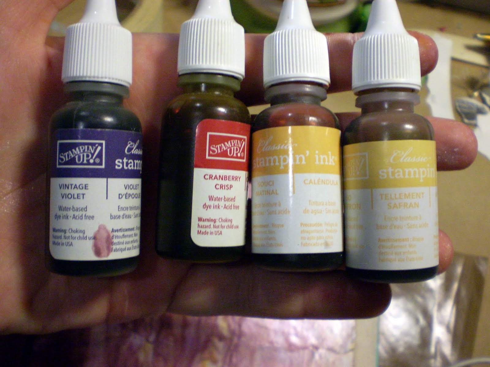
I finally got the dress done, and went to reach for a safety pin so I could pull the ribbon through the strap tubes - only to knock over a little basket that holds my india ink and a few little jars of colored india-style dip-pen ink.  That don't have tight-fitting lids.  They fell to the floor.  The turquoise opened...you see where this is going, right?  (THANK GOD the doll, the dresses, and the hair flowers were NO WHERE NEARBY when this happened!)  Turquoise is one of my favorite colors - but it was EVERYWHERE.  It took me forever to clean it all up - and even longer to scrub and slough my hands (in fact, I still have it under and around my fingernails).

I finally got the straps put on, got the dress on the doll, got her sweater put back on (which amazingly, matched her dress perfectly!), and got her hair pony made.  And once I saw how completely beautiful she looked, and how precious she was next to her soon-to-be mommy's dress...the day of disasters was ALL WORTH IT!  I only wish I could be there tomorrow morning to see her face light up when she gets to open her gifts!!!  (I'm certain her mommy will take LOTS of photos and I will get to experience it secondhand!)

Finally - last week's Inspiration Journal work!!


Seeing as TOMORROW is Inspiration Wednesday already...I figured I'd better hurry up and get LAST WEEK'S entry in my Inspiration Journal posted!!  I have been so busy being creative that I haven't had the time to sit and edit pictures or blog about them.  Hmm...must figure out better scheduling so that I can fit that in.  


So last week, Donna introduced us to her AMAZING array of watercolor crayons - hers are Caran D'Ache watercolor crayons, which look positively wonderful and I hope to try them one day soon.  I have, in my stash, two tins of Stampin' Up! watercolor crayons - so I was at least able to play with the technique, if not necessarily get the exact same quality of results (for example, mine wouldn't maintain color over gesso, like hers did).  Anyway, I loved this technique SO much - I had never used my watercolor crayons like this.  Mainly, I had used them for coloring in stamps - such a limited use!!  This was WAY more fun!!  I loved how they blended together, and I love how the crayon strokes just disappear completely when you add the water and start painting.

Like Donna did, I started out with a bit of clear embossing, to give some resist once I added the watercolor crayons.  The stamp I used ended up being too fine in detail, so much of it just looks like large areas of embossing powder - but lesson learned.  It still looks pretty cool, I think.  I also used one of my new EK Success (Michael's had them 40% off) edge punches along this side - LOVE the look!!


On the first side of the insert, I continued the color scheme and the quote (which I got off of a Tim Holtz stamp), added a Donna Downey canvas tab (using my Tim Holtz Tiny Attacher), and added a Tim Holtz acrylic tile which I backed with coordinating patterned paper.  I outlined the insert using my india ink pen (as I did most of this entire entry).


On the second side of the insert, I liked the bird idea, so I cut one from chipboard using my Cricut, glued it to the insert, and gesso'd the entire insert.  This time, for some reason, the watercolor crayons DID work (while on my main page, the gesso resisted the crayons).  I love how you can still sort of see the lines behind the paint and gesso - it was originally a receipt-tag or something like that.  I printed the word "dream" on my Brother labeler, cut the letters apart, and stuck them on the bird, then outlined everything with my india ink pen.  I added a few Prima flowers and the orange ball trim (all of which had arrived JUST THAT DAY in some AWESOME grab bags from Donna Downey's website).  (Read:  If you ever get the chance to get one - or four - of those $5 grab bags - they are so TOTALLY worth it!!!)


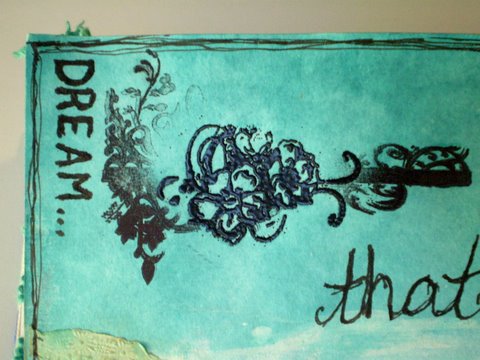
In the upper left hand of the left page, I attempted to stamp a floral-divider kind of stamp by Tim Holtz.  But despite a couple times of trying, I could not get the center of the image to stamp well.  So...I was innovative...and took a different stamp (Prima, I think?)...which was also floral and similar in look...I inked with Versamark, and heat embossed with black embossing powder.  Then I used my india ink to write "Dream" along the edge.  Overall, I ended up loving the look.  Happy accidents...they are the best!


On the lower part of the left page, I added part of a paper doily (also from a grab bag), which I had spritzed with Glimmer Mist and then rubbed over with some light brown chalk ink.  I ran the doily through my Xyron 900 to add adhesive to the entire back easily, rather than messing around with any kind of wet glue for such a delicate piece.  I stamped the umbrella man and word quote in charcoal chalk ink, but wanted the words to be bolder, so I went over them with india ink.  (Note - behind the words, you can see some of the drippage effect, from when I sprayed the page with water after I painted the watercolored areas - SO cool!!)  I, of course, had to finish up by adding a tag with the date.


So, tomorrow is another Inspiration Wednesday!  I'm just going to go ahead and say it - I probably won't get mine posted ON Wednesday!  LOL  I did do lots of creative things over the weekend, so hopefully I can get some of those things posted soon too.

Have YOU been playing and being creative???

LinkWithin

Related Posts Plugin for WordPress, Blogger...